The first generated interface arrives fast. A header, a grid, a few cards, a gradient, a CTA. It looks like a product. It has the shape of one, and for about thirty seconds it's convincing.
Then you start using it. The primary action is the third-most prominent thing on the page. Every card carries the same weight. The empty state is a sentence nobody explained. There are eleven type sizes. The motion is decoration. The page is technically finished and conceptually not started.
This is the gap that matters now. Generation collapsed the cost of the first draft. It did not collapse the cost of editing.
The first 80%
Models are very good at the average of the internet. That's exactly why they're right for a first draft: they know what a dashboard looks like, what a pricing page contains, which components usually sit together. If your question is “show me the conventional shape of this thing”, a machine is a decent intern.
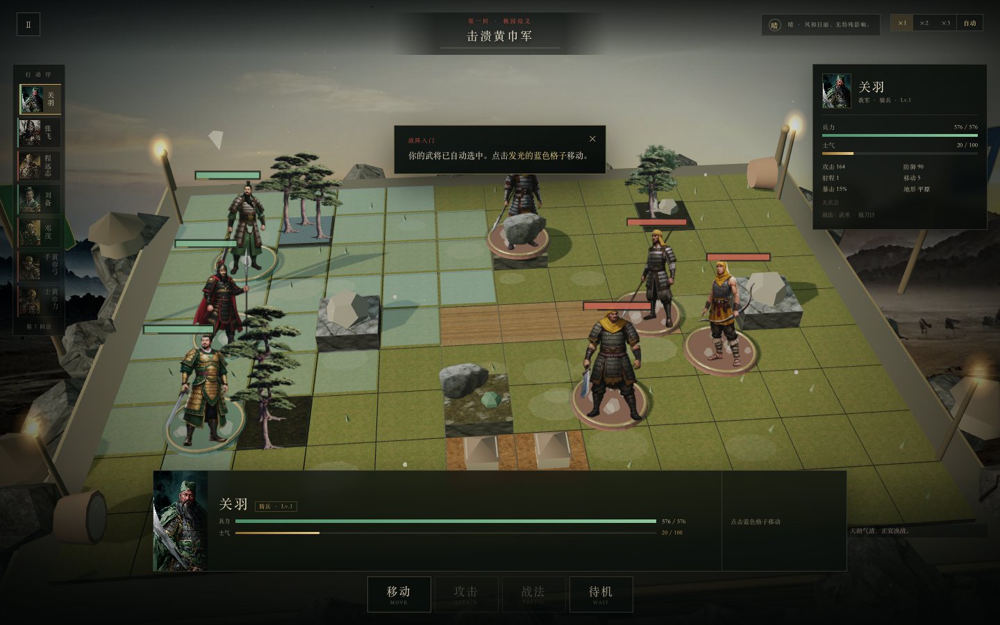
Trouble starts when the conventional shape is not the answer. A dense technical graph shouldn't share a hierarchy with a SaaS landing page. A tactics game shouldn't share a rhythm with a settings page. The model still produces something plausible, because plausible is its job. Your job is noticing when plausible is wrong.
Three failures
Everything becomes a card
Cards suit discrete, scannable items. They don't suit anything else. A page with twelve cards has no entrance for the eye. The interface isn't organizing information; it's dodging the decision about what matters most.
Everything has the same weight
Generated layouts tend to spread emphasis evenly, because emphasis requires a judgment call. The headline, the number, the testimonial and the footer link all sit at one visual level. The result is polite and unreadable. Hierarchy isn't a styling choice; it's the page's argument.
Motion as meaning
A fade-up on every section isn't a concept. Parallax isn't narrative. Motion should explain a relationship, confirm an action, or preserve context. If it does none of the three, the page is just breathing at itself.
Generation gives you options. Editing is deleting most of them.
Taste is compression
I used to think of taste as preference. Now I think it's closer to compression: saying the same thing with fewer decisions. A good screen has one dominant idea, a clear reading order, a type scale that does real work, and enough whitespace to let the idea breathe.
The compression shows up in the details. A 64px headline isn't necessarily better than a 48px one; it's better only when it changes the reading order. A border isn't better than a background; it's better only when it clarifies grouping without adding noise. Every element should justify the attention it takes.
This is also why “make it look nicer” is such a weak prompt. The useful instruction is “make the primary action obvious within two seconds, and delete everything competing with it”. That's an editorial instruction. It has criteria, and it can be checked.
A working method
When I use a model to make a screen, I don't start from a visual reference. I start from an outline:
- What question does this screen answer? Write it as one sentence, not a feature name.
- What is the one action? If there are two primary actions, you need two screens.
- What is the reading order? Number the blocks before any styling.
- What can be deleted? Remove a section before you add one.
- What are the empty, loading and error states? The generated version usually forgets all three.
Then generate, screenshot at 390, 768 and 1440, and compare the three. Responsive failure is often hierarchy failure in disguise: if the mobile layout doesn't know what matters, the desktop layout probably doesn't either.
The last pass is by hand. Not because the model can't write CSS, but because the last 10% is a series of small judgments that need a point of view: tighten this line, delete that divider, move the number out of the card, let the image lead. None of them is hard. Together they are the difference between a demo and a product.
A small rubric
I judge whether a screen is done with five questions. They're deliberately blunt:
- Can I tell what this page does within two seconds? If not, the hierarchy is doing too much.
- Is there one obvious next step? If everything is clickable, nothing is.
- Does it survive at 390px? Mobile is the honest test of desktop decoration.
- Does deleting 30% lose meaning? Usually not. Delete it.
- Does the motion explain anything? If not, cut it.
These aren't absolute standards of taste. They're filters. They make it harder for a plausible-looking screen to slide through without a point of view.
The editor's job
The uncomfortable implication: the human role didn't disappear, it moved. Less time producing a draft, more time deciding which draft deserves to exist. That isn't a lower-grade job. It's the job that decides whether the work has a voice.
Models are good collaborators and bad editors of their own output. They keep adding until you stop them. The last mile is you stopping them, choosing the one idea worth keeping, and making everything else serve it.
Note / This is a design field note, not an argument that generated interfaces are bad. The claim is narrower: generation changed the cost of production; it didn't remove the need for judgment. The screens mentioned here were edited by hand after generation.